
Box Shadow Generator: Design Beautiful Depth Effects With Free Live CSS Styling (2026)
👤 Box Shadow Generator
Visual CSS editor to design and generate custom container shadows instantly.
box-shadow: 0px 10px 15px -3px rgba(0, 0, 0, 0.15);
Modern interface design relies heavily on depth to guide human attention. Flat design looks tidy, but it can leave users guessing about what components are interactive. Adding soft elevations changes everything, which is why a Box Shadow Generator is so essential for modern workflows. Writing customized style parameters from memory turns into tedious trial and error. Our free Box Shadow Generator sits right at the top of this page to take away that continuous guessing game so you can build beautiful designs instantly. You adjust simple sliders, watch the results update right before your eyes, and grab deployment ready syntax.
What is Box Shadow Generator?
This digital generator is an interactive visual environment built specifically to craft depth parameters for container elements. Instead of saving code files and refreshing web browsers fifty times to inspect a subtle adjustment, this Box Shadow Generator lets you build the entire aesthetic within a real-time visual canvas. The app formats the property logic instantly, giving you cross browser styling code that functions on any contemporary website.
Front end developers utilize this Box Shadow Generator workspace to construct sophisticated card layouts, modal elevations, and floating button states. Marketers optimizing landing pages use it to build prominent call to action areas that lift off the screen. By controlling multiple variables inside a single interface, you eliminate errors and speed up your interface building processes.
How to Use This Tool
Building custom depth styling takes only a few seconds when using our visual canvas.
- Adjust the Horizontal and Vertical offset parameters to position the path of your light source. Negative figures pull the shadow left or up, while positive values drop it right or down.
- Slide the Blur Radius higher to soften the edges of the depth effect. Lower numbers create hard boundaries like retro designs.
- Use the Spread Radius slider to expand or contract the core size of the layout projection.
- Tweak the Shadow Opacity controller to blend the tone into your background environment cleanly.
- Change container or shade tones using the quick color pickers to match your current production brand scheme.
- Toggle the inset container checkbox if you need to create recessed input slots or pressed button states.
- Click the green copy button to save the finalized production rules straight to your clipboard.
Why Layer Depth Matters in 2026
Modern user interfaces have evolved past basic flat grids. Digital architecture relies heavily on micro structures that feel familiar to human eyes. When an overlay window appears on top of a data table, its physical separation needs to be clear. Soft layers communicate priority levels instantly without adding text instructions or complex graphics, and utilizing a Box Shadow Generator keeps your design process highly accurate.
A major shift in modern web layouts centers around micro depth. Massive dark outlines feel heavy and dated. Modern styles demand barely visible borders combined with highly expanded blur ranges. These parameters require high precision. A single pixel shift alters a component from looking like an enterprise application element to a cheap template. Having a dynamic Box Shadow Generator helps ensure your digital systems look uniform and premium.
Advanced Strategies for Multi Tier Elevation
Creating realistic digital interfaces means treating your viewport like a physical space. Objects closer to the viewer must cast distinct profiles compared to objects resting flat against the floor. Using a singular style template across every card, window, and navigation menu breaks visual logic, making a visual Box Shadow Generator highly helpful for mapping separate states.
Consider building a clear elevation scale using three distinct tiers. Low level components like content cards look best with minimal vertical drop and tight blur values. Middle tier components like floating menus or drop downs look more natural with an increased vertical offset and a wider, softer blur range. High elevation assets like modal overlay windows require significant vertical offset combined with large blur radii and incredibly low opacity settings to feel realistic.
Another crucial trick involves matching container tones. Placing a dark pitch black silhouette behind an element sitting on a bright white canvas ruins the illusion. Utilizing soft grays or introducing a microscopic hint of your brand primary color into the Box Shadow Generator color picker creates an incredibly premium look. This technique matches how natural light refracts and bounces off physical objects in the real world.
Common Mistakes to Avoid
- Using Raw Black at High Opacity: Applying heavy dark colors creates muddy layouts that distract users from reading text. Keep your transparency values below fifteen percent for clean results on standard light interfaces.
- Ignoring Ambient Environment Tones: Shadows look best when they blend with surrounding elements. If your page background uses a soft warm ivory tone, your container depth should feature a tiny hint of warm brown or amber instead of pure neutral gray.
- Mismatched Light Sources: Ensure every container component on your web page uses identical directional properties. Having one card cast a drop downward while an adjacent container casts a drop upward breaks visual harmony and confuses viewers.
- Overcomplicating Mobile Viewports: Large complex layout styles lose their impact on cramped mobile screens. Keep spread levels tighter and blur distances lower on small devices to prevent layouts from feeling cluttered.
Using our visual Box Shadow Generator helps you spot these layout errors immediately on the canvas before the code ever goes into your live stylesheet files. Take some time to test out different parameter combinations right now to build the perfect card layout for your current web production.
Related Tools on ToolsStackPro:
- CSS Gradient Generator: Create Beautiful Backgrounds Instantly, Free Online Tool (2026)
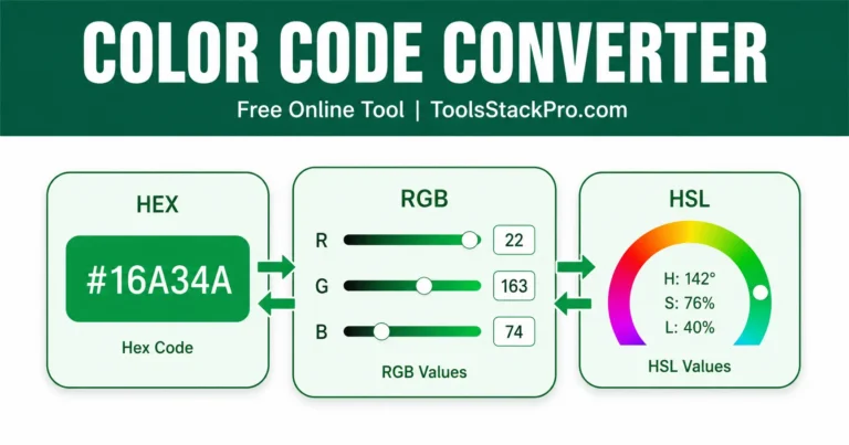
- Color Code Converter: The Easy Way to Switch Between HEX, RGB, and HSL (2026)
- API Response Beautifier: Format, Validate, and Minify JSON and XML, Free Online Tool (2026)
- Robots.txt Generator: Build Crawl Rules Fast, Free Online Tool (2026)
- Meta Tag Generator & Preview: Optimize Your Website Snippets Free Online Tool (2026)

The live preview with adjustable sliders makes it much easier to understand how offset, blur, and spreadBox Shadow Generator Comment work together instead of relying on trial and error. One feature that could make the tool even more useful would be a few preset shadow styles for common UI elements like cards, buttons, and modals so beginners have a solid starting point before fine-tuning the values.